Nestled in the thin air between the stodgy tradition of genteel men’s magazines and the waggery of gear, girls and gadgets fare, Details Magazine appealed to a loyal base of highly-educated, cosmopolitan and fashion-conscious men-on-the-street. Since its inception in the 90’s, an illustrative use of display typography had been its hallmark. But as the frolicsome typography of the 90’s gave way to sophistication and refinement, the time had come to do away with the gimmicks of its decorative run-of-book format. We wanted to improve readability via a more elegant presentation but without resorting to the now-ubiquitous dogma of grids and Helvetian edicts. We wanted to clean up the act but still retain the eclectic personality of the book. Above all, we wanted to create a format that would compliment the art direction of the content rather than compete with it. This meant tempering down the graphic design and distilling it into more subtle format cues. In between my role in getting each monthly issue to press I dove into the redesign.
Before
After
Before / After
Before
After
Before / After
Format
Details’ front-of-book was divided into four themed sections. The previous design had each section title writ large across the opening page, each in a different typographic style. This made the sections appear as sub-magazines within the larger magazine, leading to a certain lack of continuity. The section pages also lacked any header framework to contain the content. The sectional rubrics were stylistically diverse logos that lacked a common design theme, giving each section the feel of an advertorial package. I began by redesigning the sectional rubrics as a common font of stylized letterforms that exhibit the typographic invention that was Details. I drew a wide variety based on an outline style, incorporating a twist between rounded and squared off elements. Most challenging was the rubric for the 'Know and Tell" section, culminating in that wonderful 'aha' moment when the ‘K’ and ‘T’ just nested together.
Rubric Icons
Rubric Typescript
For the actual section titles, I drew ligatured, heavy weight serif typescripts. The intention here was to inject editorial personality into the formatting, to offset the stark modernism of the rubric icons and to lend a fashionable touch to a fashion publication.
Run-of-book typeface
A signature sans-serif typeface was vital to our vision of a format based on modern refinements. Unfortunately, our budget did not provide for a commissioned, custom-drawn typeface. I therefore began drawing one in-house. As our schedule contrained this effort to a limited character set, we also had to find an existing font that would family with this typeface. An extensive search yielded Vaud, a pleasing update on Helvetica produced by a small Japanese type foundry. It didn't have the signature personality to serve our subhead needs but proved perfect as a complementary body-text workhorse. Our solution was to modify the weights of my signature typeface designs to visually integrate with Vaud in heads and subheads. The signature typeface departed from the text in subtle details: square rather than rounded punctuation, a slightly wider geometry and design variations on key glyphs. The result combines the stark elegance of Vaud in text with a unique typographic signature in larger type elements. A light weight variant was then created for decks and a medium for rubrics. We chose to retain the enduring serif typefaces of the old format which include Hubert Jocham's opulent Narziss and Jeremy Tankard’s brilliantly modernized, calligraphically-inspired Enigma family.
Vaud vs Custom Typeface
Vaud (top) Custom Typeface (bottom)
Grid & Furnishings
Page furniture was to be consistent and section-defining through the use of the rubric icons but otherwise minimal and unobtrusive. Light headers were based on rulings at the top of page. To provide a visual anchor for the grid, I created a custom ruling style based on a pattern of vertical strokes in lieu of a more generic solid rule. Below this a very light second rule defines the header area. An extension of this rule curves to frame the sectional rubrics which are nested at the page corners. Careful attention was paid to the smallest details.
For a cleaner look, the upper rule could be omitted when it wasn't needed.
Triad 'pointer' device
Custom-drawn Q&A script
Masthead Logo
The final challenge was the venerable masthead logo. The existing logo had been left untouched for over fifteen years despite being inherently flawed. The letterforms are spacially uneven and result in drastic kerning issues. There are capacious gaps and three-way pile-ups. Informed that the publisher would not be amenable to a drastic change, I set about revising the existing logo, drawing a more balanced and subtle evolution. I incorporated some of those rounded forms that drove the design of my interior rubrics to unify the design theme. I completely redrew each individual letterform to have consistent stem widths and more consistent matrix widths. I extended the central arm of the 'E' to fill the spacial void there. The 'D' became a bit rounder. I redrew the 'S' entirely to feel more balanced. The weights are identical to the existing logo but the letterforms are a bit more extended. The result is a refinement that would be more felt than seen by most readers. However, this new logo was still not integrated when the magazine closed in 2015.
Original (top) Revised (bottom)
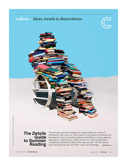
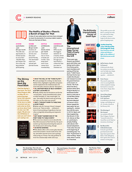
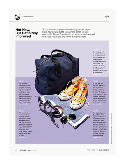
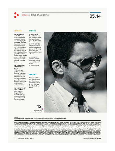
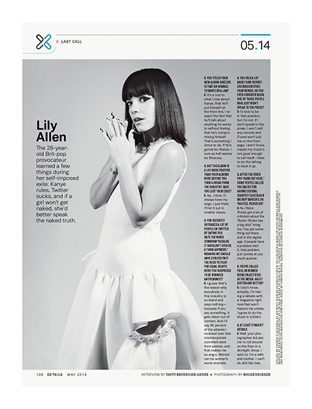
May 2014 / Selected Pages
Click for larger view